APPLE SEED APP REDESIGN
SEED is Apple’s global partner-facing sales advocacy app.
The business goal of the app is to connect Apple partners to Apple technology and enable them to advocate for Apple’s products to end-consumers at global point of sales, and to small, medium and large enterprise customers.
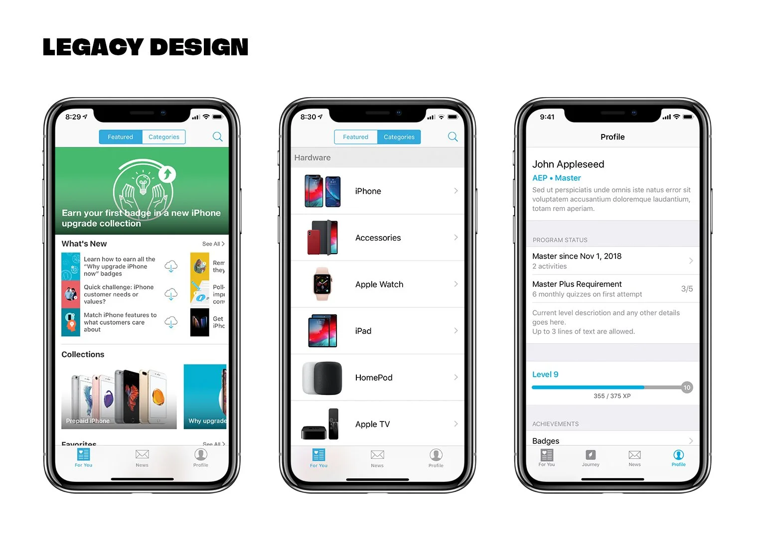
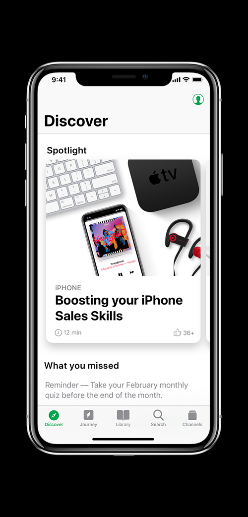
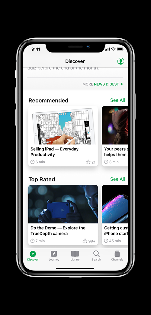
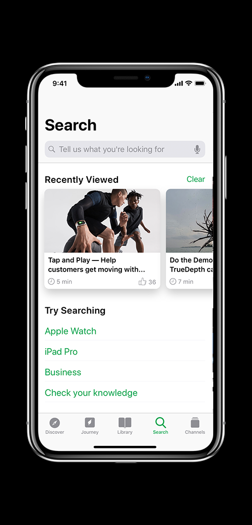
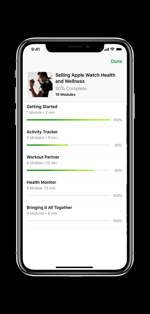
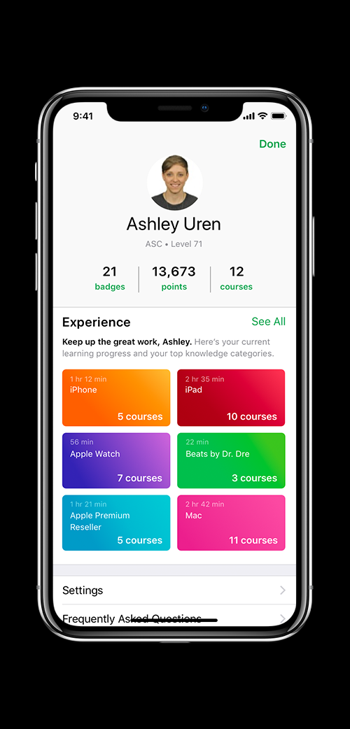
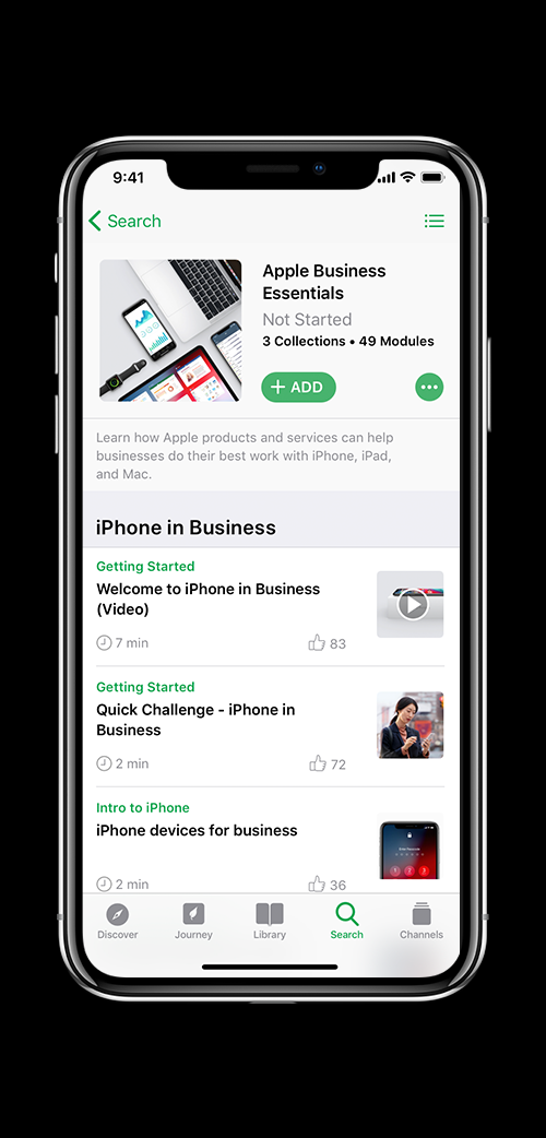
In 2020, when the global audience went all digital due to the pandemic, we decided to overhaul the design of the app which at that point was about 8 years old. The video featured here - created in partnership with Toronto-based creative agency Tendril- showcases the new design.
My role in this project was to shape and define the approach to the app redesign and creative direct all the touchpoints for the launch.
APPROACH
iOS-First Design: There was belief in the organization that most of our users were android/web users. So we had prioritized designing the web app at the time for maximum adoption. Which was diluting our experience for those folks who did have iOS. I did a little digging and got data that showed we had 100% more iOS users and growing, than android or web users . This convinced our executive leadership that our approach to design it as iOS first was the right one.
Blue Sky Approach: The other challenge we had was that the existing app had a complex architecture due to its integration with partner systems and other sales tools such as audience management and publishing. If we were to keep the complexity in mind as designed we would only get incremental improvements. I advocated for us to keep our user in mind and go for a blue sky approach. And once we knew exactly what we wanted, we could scale back keeping constraints in mind. This approach helped us try new solutions that we wouldn’t have tried otherwise.
Deliver Apple Quality End-to-End: This project not only required a redesign but needed a new strategy for digital rewards, retro fit all content to the new image sizes at scale (which was 1000s and 1000s of images) and create engaging touchpoints for our partners such as launch video, augmented reality experience and swag- all of which was implemented by my team and with some vendor help- all while keeping a keen eye on consistency and Apple’s high bar of quality.
NEW DESIGN
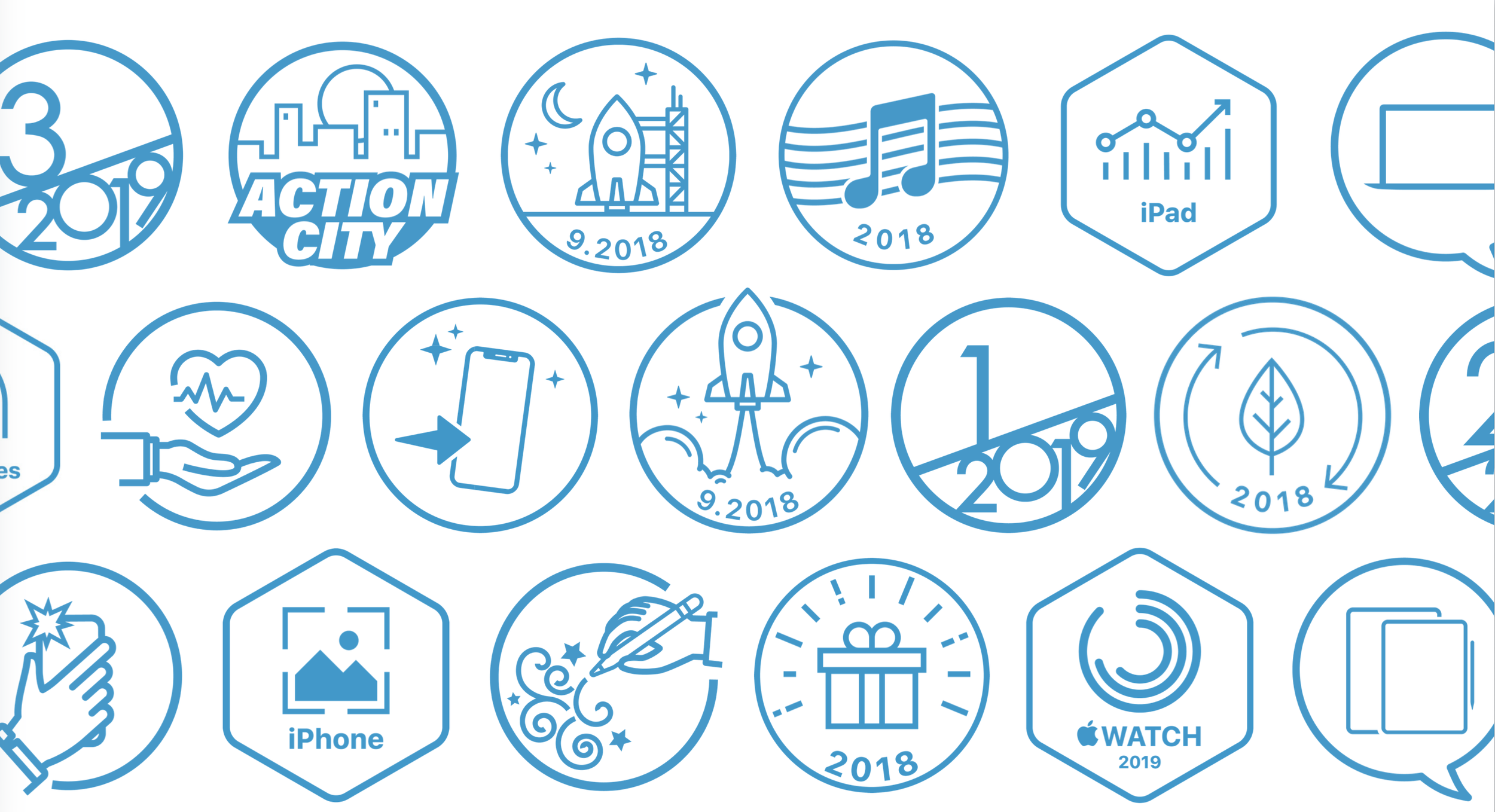
LEGACY BADGE DESIGN
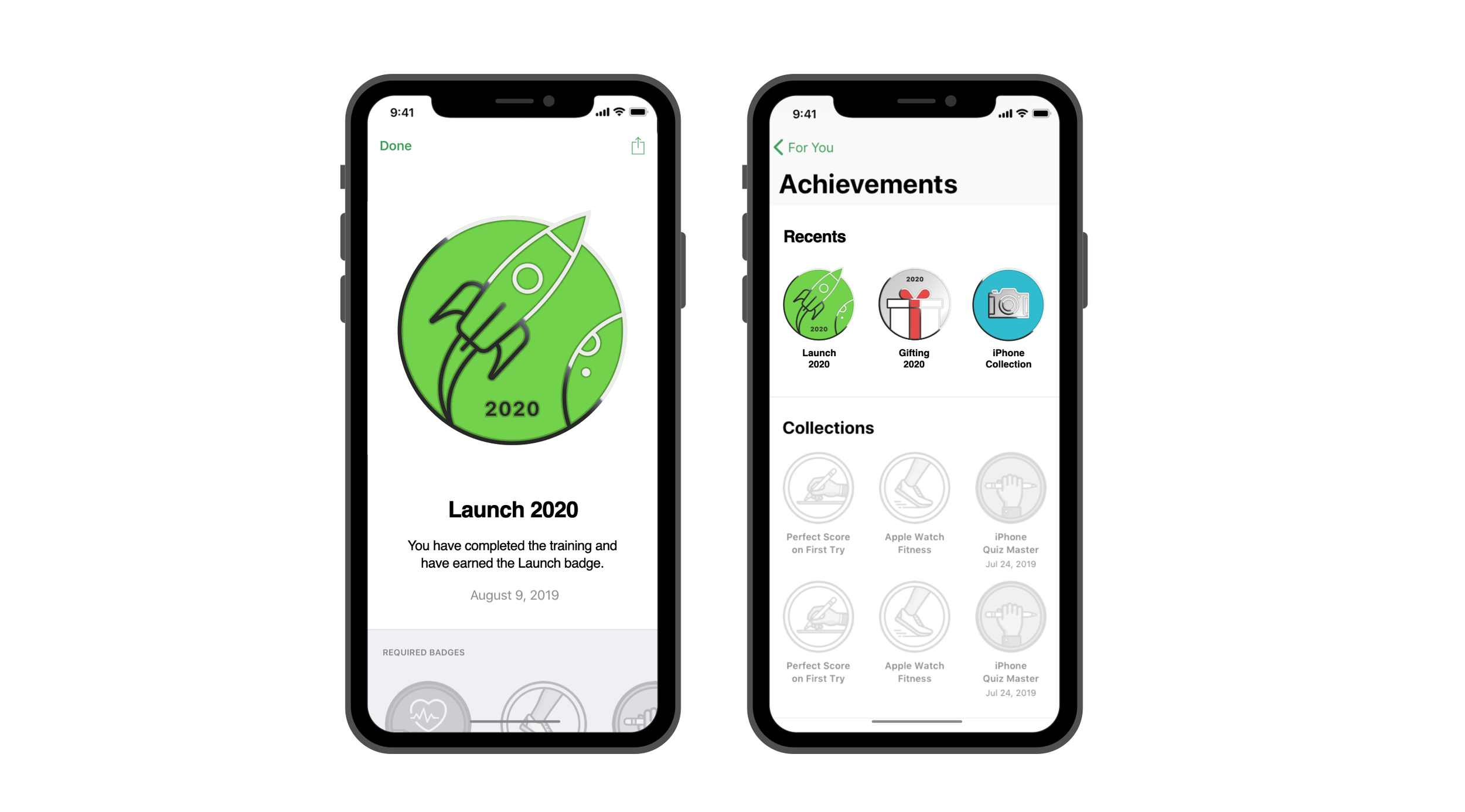
For every collection of assets completed, the user earned a completion badge on the app. The legacy badge design had been minimal, one dimensional and needed to keep up with the evolving Apple design language.
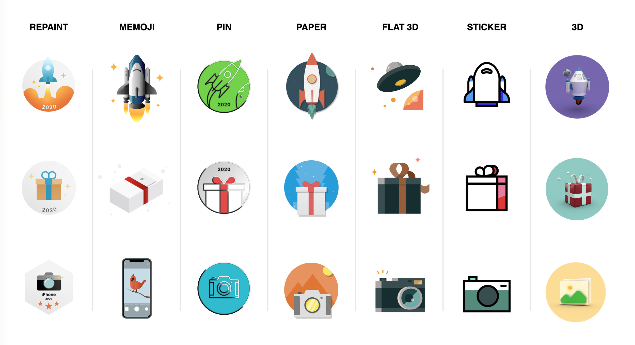
EXPLORATION
We explored a variety of design styles for designing the badges. The badges needed to be scalable globally, and would need to be created locally. So we had to think of a style and system that was replicable.
NEW BADGE DESIGN
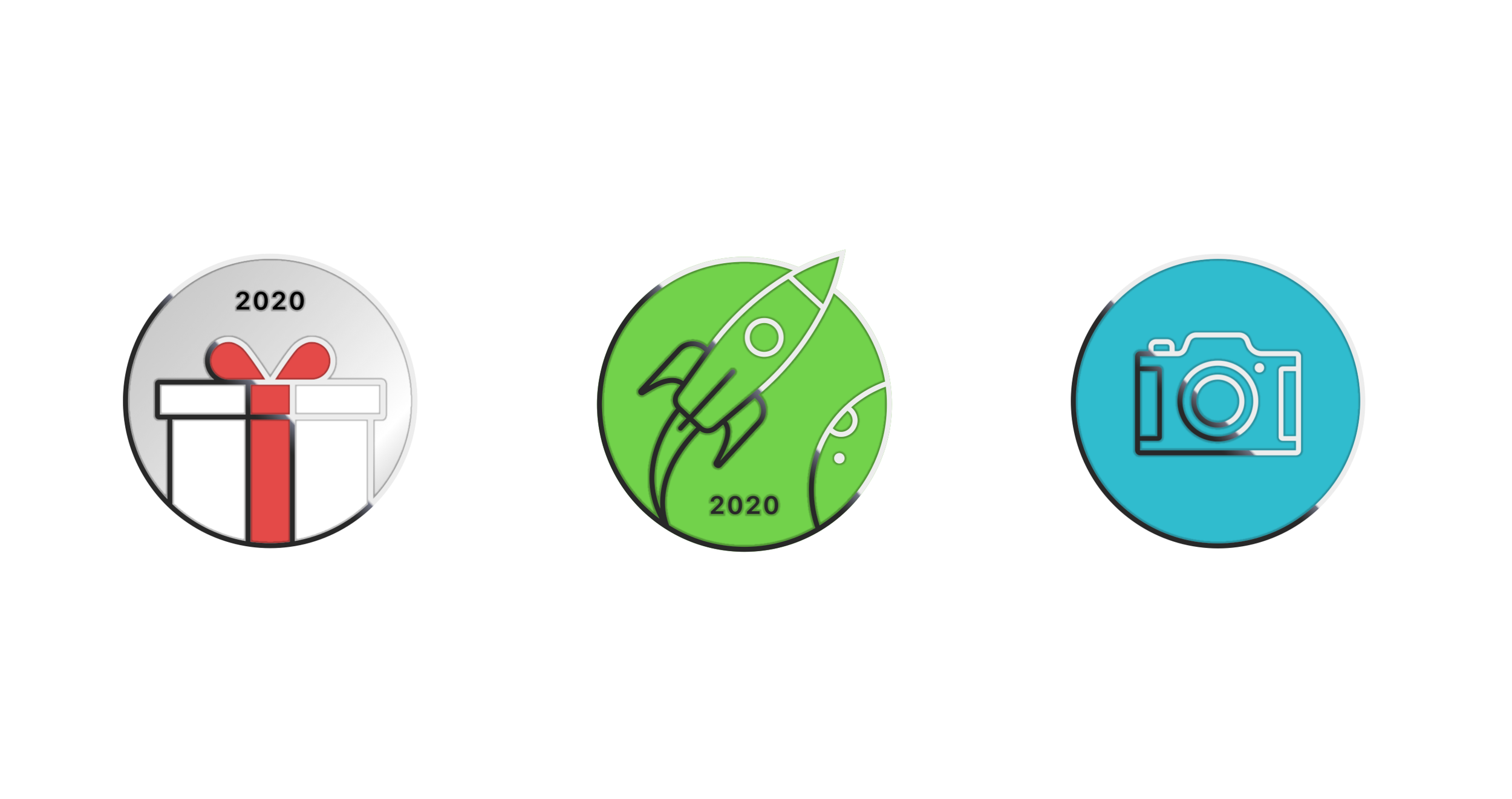
To maintain consistency with the evolving Apple design language, we landed on a metallic looking badge and designed in a way, where we could scale it globally to all regions, so that even a non-designer would be able to to recreate this look using Keynote.